Economics
A Bigger Picture Look At US Housing Affordability (Or Just How Over-Priced Are American Homes)
A Bigger Picture Look At US Housing Affordability (Or Just How Over-Priced Are American Homes)
Via Political Calculations blog,
What can…
A Bigger Picture Look At US Housing Affordability (Or Just How Over-Priced Are American Homes)
Via Political Calculations blog,
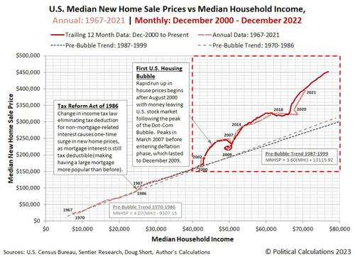
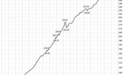
What can you discover when you chart median new home sale prices against median household income?
Here’s the visualized beginning of the answer to that question, using annual data from 1967 through 2021 and monthly data from December 2000 through December 2022!
What you first see is there are some long running and often linear relationships between these two variables.
And what you find is that when you get to 2000, bubbles begin inflating that break down those relationships.
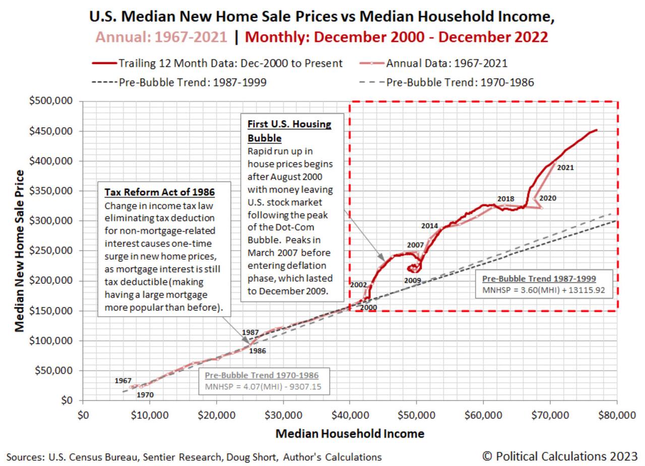
We’ve highlighted that region with the red-dashed lines in the chart, so let’s zoom in on it in the next chart.
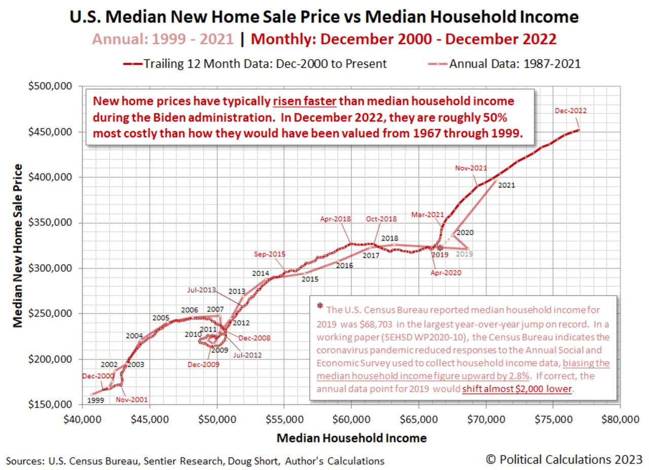
The second chart answers the question of what the relationship between median new home sale prices and household income would have looked like had 2020’s coronavirus pandemic not messed up the U.S. Census Bureau’s collection of income data for 2019!
Going back to the first chart, you also get the answer to another question: How inflated are house prices today compared to how they were prices before the housing bubbles?
As of December 2022, At just over $450,000, the trailing twelve month average median new home sale price costs around 50% more than what they would had the relationships that existed before 2000 continued to the present day.
Going by most observers, there have been two major housing bubbles in the 21st Century. The inflation phase for the first housing bubble had its origins in August 2000 and peaked in March 2007. Its deflation phase then lasted until December 2009. What we would consider the second housing bubble took off in July 2012. This more recent bubble has had several phases, but using the measure of median new home sale prices, has only begun to deflate in the last several months. That development is only starting to show up in the twelve month moving averages we’ve presented in these charts.
These bigger pictures provide a little different, but very useful way to look at the underlying data for assessing how affordable housing is within the U.S. We’re looking forward to seeing how they evolve during the course of this year.
Tyler Durden
Wed, 02/08/2023 – 14:25
inflation
deflation
bubble


Argentina Is One of the Most Regulated Countries in the World
In the coming days and weeks, we can expect further, far‐reaching reform proposals that will go through the Argentine congress.

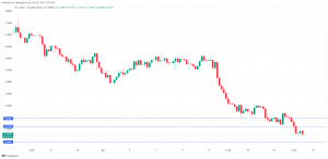
Crypto, Crude, & Crap Stocks Rally As Yield Curve Steepens, Rate-Cut Hopes Soar
Crypto, Crude, & Crap Stocks Rally As Yield Curve Steepens, Rate-Cut Hopes Soar
A weird week of macro data – strong jobless claims but…
Fed Pivot: A Blend of Confidence and Folly
Fed Pivot: Charting a New Course in Economic Strategy Dec 22, 2023 Introduction In the dynamic world of economics, the Federal Reserve, the central bank…


