Economics
Inflation
The specter of inflation has received considerable attention over the past year. Indeed, the Fed’s increases in its target for the Federal funds rate…
The specter of inflation has received considerable attention over the past year. Indeed, the Fed’s increases in its target for the Federal funds rate have been couched in terms of reducing inflation. The Fed’s aggressive increases are likely geared to avoiding an increase in inflation expectations. When will the Fed know it has done enough?
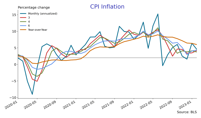
Headline CPI (Consumer Price Index) inflation, based on year-over-year changes in the CPI, has remained well above the Fed’s stated 2% inflation target since early 2021. However, as shown in the chart below, annualized monthly inflation rates were running above target starting in late 2020. This figure illustrates some of the problems associated with looking at annual inflation rates: they are slow at picking up changes in trend. That said, monthly inflation rates are quite volatile as can be seen in mid-2022. In a sense, what we would like is to draw a line free-hand through the monthly inflation rates. The chart below shows that annualized inflation rates over a 3 or 4 month horizon do pretty well in responding reasonably quickly to the ups and downs of the monthly inflation series, while at the same time exhibiting less volatility relative to the monthly series. The 6 month annualized inflation rate suffers the same problem as the year-over-year measure: too much of a lag in following the monthly inflation rate up and down.

So, while monthly inflation rates were pretty much on target by late 2022 (the grey line is at 2%), the 3-month inflation rate was still running above target. In the first two months of 2023, monthly inflation has, again, risen above target; the 3-month average “sees through” these fluctuations. The graph below removes the 4 and 6 month lines to make it a little clearer.

In broad terms, core CPI (that is, excluding food and energy prices) inflation tells the same story: the annual inflation rate took a considerable period of time to reflect the increase in the monthly inflation rate. Roughly speaking, the trend for monthly core CPI inflation has been flat at 5.6% since the start of 2021. Again, the 3-month average core CPI inflation rate presents a nice compromise between smoothing out the month-to-month changes in inflation, and the over-smoothing associated with the annual inflation rate.

The usual motive for looking at core inflation is that removing the volatile food and energy components gives a better measure of trend inflation. Comparing the two charts above, it is difficult to see that core CPI inflation is, in fact, a good measure of the trend in overall CPI inflation.
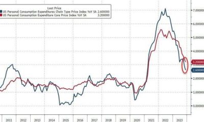
Those attuned to monetary policy know that the Fed’s preferred measure of inflation is based on the Personal Consumption Expenditure (PCE) price index. Keep in mind that the PCE is only available until January 2023; the February numbers will be available much later this month. The chart below shows that this measure of inflation poked above the Fed’s 2% target early in 2021, and has pretty much stayed there. Once again, the annual inflation rate lagged behind the monthly inflation rate trend; the 3-month inflation rate smooths out many of the wiggles in the monthly inflation rate while responding reasonably quickly to changes in trend.

So, why is this such a big issue? There are some obvious and maybe not so obvious reasons. The most obvious reason for the fight against inflation concerns the purchasing power of a dollar. Inflation erodes nominal earnings. The easiest way to see this is to compare year-over-year changes in the CPI to year-over-year changes in nominal average hourly earnings. In the graph below, the red line plots CPI year-over-year inflation and the blue line plots year-over-year changes in average hourly earnings. When the red CPI line is higher than the blue average hourly earnings line, it means real earnings are falling…an hour of work buys fewer goods and services since prices grew faster than wages. Real wages rise when the blue average hourly earnings line is above the red CPI line. Starting in 2010 until the pandemic, average hourly earnings were growing between 2 and 3%; however, inflation was lower than that and so real earning were rising. After the pandemic, average hourly earnings were growing in the 5-6% range, the fastest growth in a decade, yet real earnings started to fall due to the higher level of inflation. At the height of inflation in mid 2022 (around 9% inflation) real earnings were falling by about 4% since the growth in wages was about 5.4%.

The chart above shows that sometimes workers “win” (earnings growth exceeds inflation), and sometimes they “lose” (earnings growth does not keep up with inflation). What’s relevant is whether workers tend to win more than they lose. To see this, the chart below plots average hourly earnings against two price levels, the CPI and the PCE deflator. All three series are set to 100 at the onset of the pandemic, and are measured in logarithms. There are two practical consequences of using logarithms: (1) straight lines represent constant growth rates, and (2) a constant gap between any two lines represents a constant percent difference between the two. This chart shows that real earnings rose during and after the pandemic: the blue earnings line rose above both of the price indices. No doubt, some of the rise in average hourly earnings early in the pandemic reflected the fact that job losses were concentrated among lower wage workers. Starting in mid-2021, CPI inflation started rising, and the red CPI line exhibits faster growth than the blue earnings line. By mid-2022, the red CPI line passed above the blue earnings line. Since then, average earnings have more-or-less tracked the CPI. By this metric, real earnings are more-or-less back to where they were prior to the pandemic. Notice that when earnings are measured against the PCE price deflator, real earnings are higher now than at the start of the pandemic: the blue earnings line is above the green PCE deflator line.

The next chart gives a longer view of earnings and prices. Now, earnings and prices are set to 100 in early 2006. During the Great Recession, real earnings fell: the red CPI line rose above the blue earnings line. Since then, the blue earnings line consistently exceeds either of the price lines reflecting an increase in real earnings since 2006. However, remember that the gap between earnings and, say, the CPI represents the percentage difference between earnings and prices. With this in mind, after 2010, the gap between earnings and the CPI shrank: real earnings fell relative to 2010. Starting in 2014, a growing gap emerged between earnings and the CPI reflecting increases in real earnings. So, while the chart above indicates that real earnings are back to where they were 3 years ago, over the past 15 years, real earnings have risen.

Inflation, however, does not affect everyone equally. For example, lower income individuals have by way of net wealth. Hand-to-mouth consumers suffer when the prices of the goods they buy rise at a faster clip than their incomes. Those with higher incomes also, typically, have positive net worth. Not only can they buffer their consumption against fluctuations in their real incomes, they also have access to investment opportunities that tend to protect their wealth, and so investment income, from the ravages of inflation. These investment opportunities range from interest-bearing bank accounts to the stock market.
The outcome of the March 21-22 FOMC meeting was a 25 basis point increase in the Fed Funds rate:
Recent indicators point to modest growth in spending and production. Job gains have
picked up in recent months and are running at a robust pace; the unemployment rate has
remained low. Inflation remains elevated.
The U.S. banking system is sound and resilient. Recent developments are likely to result
in tighter credit conditions for households and businesses and to weigh on economic activity,
hiring, and inflation. The extent of these effects is uncertain. The Committee remains highly
attentive to inflation risks.
The Committee seeks to achieve maximum employment and inflation at the rate of
2 percent over the longer run. In support of these goals, the Committee decided to raise the
target range for the federal funds rate to 4-3/4 to 5 percent.Federal Reserve Press Release

dollar
inflation
monetary
reserve
policy
fed
monetary policy


Argentina Is One of the Most Regulated Countries in the World
In the coming days and weeks, we can expect further, far‐reaching reform proposals that will go through the Argentine congress.

Crypto, Crude, & Crap Stocks Rally As Yield Curve Steepens, Rate-Cut Hopes Soar
Crypto, Crude, & Crap Stocks Rally As Yield Curve Steepens, Rate-Cut Hopes Soar
A weird week of macro data – strong jobless claims but…
Fed Pivot: A Blend of Confidence and Folly
Fed Pivot: Charting a New Course in Economic Strategy Dec 22, 2023 Introduction In the dynamic world of economics, the Federal Reserve, the central bank…